"The basic elements of design described by Vitruvius have remained essentially unchanged since the time humans first began to shape their environment. Architecture, Vitruvius wrote, must provide utility, firmness, and beauty." "By utility, Vitruvius meant the functional arrangement of rooms and spaces so that there is no hindrance to use and so that a building is perfectly adjusted to its site. Firmness referred to foundations that were solid and to building materials being used wisely to do their required work. Beauty meant that "the appearance of the work is pleasing and in good taste, and its members are in due proportion according to correct principles of symmetry."" - Roth p11
The two images below represent two structures that fulfill perfectly the qualities of commodity, firmness, and delight. Stonehenge, discovered thousands of years ago, has many different and possible reasons behind it. There are some people who believe that stonehenge was built to keep track of time. From the position of the sun an stars you can keep track of the months, and the hours of the day.
Because stonehenge is so large it is hard to understand why it would be so unless it was meant to be viewed from the heavens, which brings us into a more religious reason for the existence of stonehenge, or potentially the notion of space travel.
It's circular formation also manipulates it's environment in a very interesting, and aesthetically pleasing way. Because it is located in a somewhat open space you are drawn directly to it. The blocks, which have all been severely weathered over time alongside tampered with, are all set into a circle. This cannot be by accident. Not only are you drawn directly to these immense rocks, but you are drawn to the center of the circle, which seems to connect you to the stones in a much more meaningful way than if you were to walk around the outside of them.
(Below image taken from http://www.aboutstonehenge.info/images/education/stonehenge-wallpaper-1.jpg)

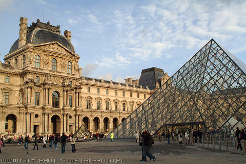
The Louvre in Paris, France is also a really great example of good design. The exterior of the building is so stunning and royal that you almost don't need to see the interior. The contrast between the very modern triangular arches and the old fashioned, cathedral like building is very interesting. They seem completely separate from each other, and yet they are connected. The interior of the building fills it's purpose fantastically. It protects the priceless pieces of artwork, while at the same time displaying them in a very visible way. As you walk through the building, you are lead very easily from artwork to artwork in a very bright, naturally illuminated environment. You never get bored or tired of walking through this building.
 (above image taken from http://world city-photos.org/paris/louvre_in_paris/pictures_of_the_louvre_in_paris.jpg)
 (above image taken from http://world city-photos.org/paris/louvre_in_paris/pictures_of_the_louvre_in_paris.jpg)
No comments:
Post a Comment