
Friday, 13 November 2009


Monday, 26 October 2009

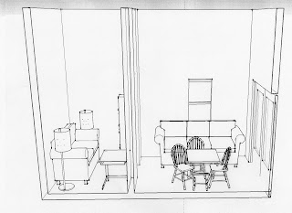
Rendered Floor Plan
 This is the rendered axonometric view of the my interior space. I included shrubbery and in this view as well as floor levels. It was more easy to depict floor level changes in the axonometric view.
Midterm
For our midterm we were asked to draw a section view of our interior three times. We were then asked to render each one. One should be experimental and somewhat messy, the other more refined, and then the final one should be very refined and well shaded.


Monday, 28 September 2009

SYTYCD Nikon Camera
 For this weeks "So you think you can ('t) draw" we were asked to draw a camera on white paper with black ink and then render it in photoshop to practice using photoshop more. We were asked to include something to show scale. For this i included a lady bug. I used the lighting tool to make it look as though the camera flash is in action and to show the reflective quality of the camera lens. I also used this technique to show light on the lady bugs wings.
Thursday, 24 September 2009
Three different perspectives
 In the perspective shown above i selected different parts of the walls and manipulated their colors and levels of saturation to give the room a very different feeling. I also exaggerated the shading more in certain areas of the perspective.
 In the above perspective i changed the color of the walls, the floor, the table, the floor lamps and i darkened my scale figure and lightened the shading a little.
  I really wanted to exaggerate shading a lot more than i did in my original perspective for one of these experimental views. So in this perspective shown above i used the burn tool to create an excessive amount of drastic shading.
 Tuesday, 22 September 2009
New Perspective

Thursday, 17 September 2009
Color Study
This week we were assigned to render a single perspective of our "sketch up rooms" in three different ways.
 One was meant to be well shaded an structured with a cleaner line.
 The next one was meant to be somewhere in between, with more structure but still not completely freehand or perfect.
  One perspective was supposed to have excessive shadowing and color.
All of these perspectives were meant to be rendered with colors found in our Maud Gatewood inspiration image.
Tuesday, 15 September 2009
Design visualization
The "so you think you can ('t) draw" for this week was to create a header for the second year blog. 

Secondly we were asked to render the space we designed on sketch up, these images below are the result of this assignment.


Thursday, 3 September 2009
Joint: So You Think You Can't Draw: 1
 I chose to draw the hand. When i was first assigned this project i had no idea what i was going to draw. I looked up "joint" in the dictionary and from the multiple definitions that i found i was able to narrow some things down in my mind but there was still very few limitations to what i could draw.
 Looking through my sketchbook from last year i noticed how much i had improved in the past year and how my sketches of hands in particular were more successful. I decided to show this and draw a hand for this first assignment.
Wednesday, 6 May 2009


Explorations
 (Image taken from: http://www.jazzguitarzone.com/jazzcity.jpg)
 Music is one of my passions, and i think that a lot of creativity or thought stems from it. The guitar is one of my favorite instruments and takes a lot of precision and craft to make.
 (Image taken from: http://www.drivesafenv.com/images/bicycle_yellow.png)
(Image taken from: http://www.drivesafenv.com/images/bicycle_yellow.png) The bicycle is not only a very functional design, but it is very earth friendly and a fast way to get around, and keep healthy.
 (Image taken from: http://www.analogartsensemble.net/blog/rubberband.jpg)
(Image taken from: http://www.analogartsensemble.net/blog/rubberband.jpg) The rubber band is also one of my favorite designs. Not only does it help when you haven't had enough time to do your hair, especially in this major.


This house not only holds so many fond memories for me but it's location is perfect, two blocks from the southern jersey shore, and walking distance from every shop on the island. It is extremely functional, even for a family of seven.
 (Image taken from: http://www.salotteries.com.au/library/Telephone-results.jpg)
(Image taken from: http://www.salotteries.com.au/library/Telephone-results.jpg) A telephone is one design, or invention that has developed over time. It started out large and difficult to maneuver, but it is now small enough to fit in your pocket and works without buttons. It's incredible to think of how things develop.
 (Image taken from:http://www.notonthehighstreet.com/uploads/partners/Papilio/500/1685_pair_of_ceramic_door_knobs_in_
 Although I don't get to see mine very often, being an I.Arc major, i think that a bed is my favorite thing.

(Image taken from:http://www.notonthehighstreet.com/uploads/partners/Papilio/500/1685_pair_of_ceramic_door_knobs_in_ What did people do before there were doorknobs? Door's would not latch. They would stand open. YOu would have to prop something against them in order for them to stay shut.
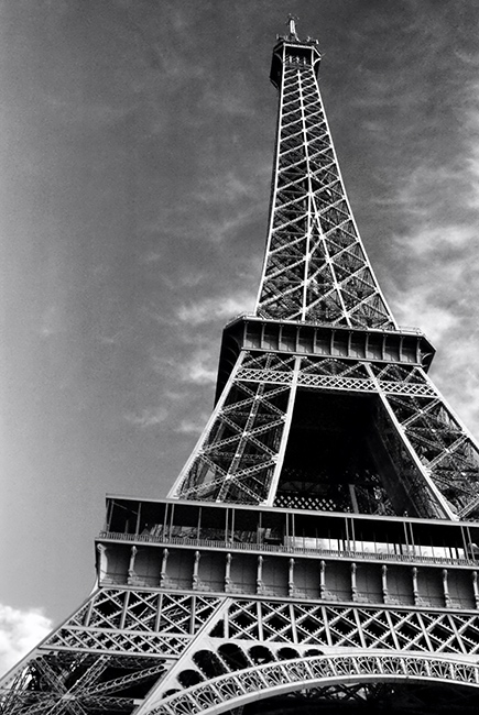
La Tour Eiffel is my favorite structure. A monument not only for France but for one of my fondest summers.
Although I don't get to see mine very often, being an I.Arc major, i think that a bed is my favorite thing. 
Shoes are some of my favorite items of clothing. They say a lot about the people wearing them.
Surfboards are great designs as well, they have to be a certain form in order to cut through the wave, and almost like an upside down ship they have fins that allow them to move steadily down the wave.
Subscribe to:
Posts (Atom)