Wednesday, 28 April 2010
A PLACE i would be happy to re-design
Happy Place


This is the southern coast of New Jersey. The shore. My family has been going there since before i was born. We got this yellow house when i was two and we've gone there for at least three weeks every summer. It's two blocks away from the beach and two blocks in the opposite direction from the bay. All stores and food joints are a block away on Dune Dr. I have never had a bad summer at this magical place. With a ping pong table in the garage and a few surf boards our family never gets bored and when we get sick of each other there's always an escape to the porch with a book. All of he harry potter books have been read thoroughly several times over on this porch. I only wish i could spend more time here.

Tuesday, 20 April 2010


Friday, 16 April 2010


Monday, 12 April 2010

USER WANTS:NEEDS
-Lots of cooking space for Ana
-Spots for the girls to sit and watch
-Separation zones between the sisters in their bedroom
-Space for the family to relax together
-Office work space for the mom
-Entertainment space for guests
-Spots for the girls to do homework (at desks)
-Bedroom/Sleeping Space
-Bathroom, Bathtub, B'day
-Storage-bathroom supplies, food, blankets
-Ventilation- overhead fans, vents
-Quiet acoustics in girls room
-Hard wood flooring for easy clean in kitchen space
-Tile for easy clean in bathroom
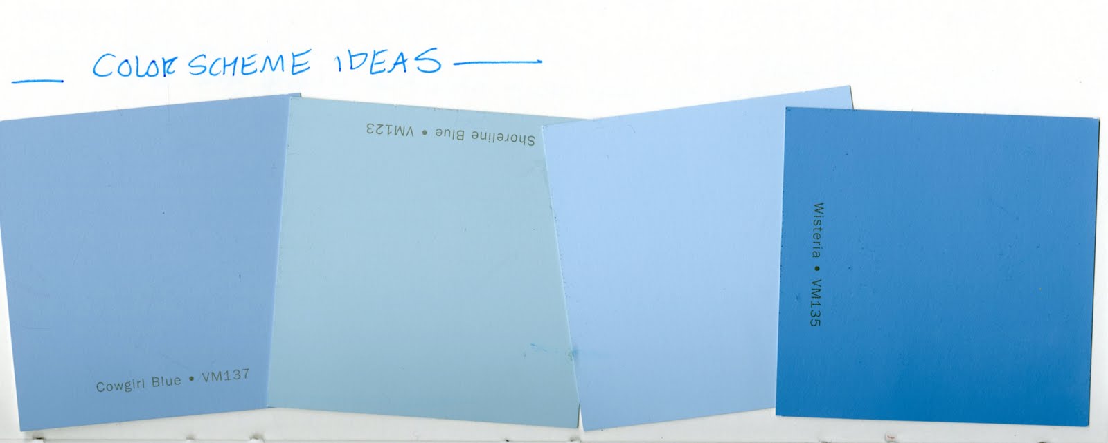
-Warm colors
-Natural lighting
-Textures (stucco)
-Culturally reminiscent components within the space
CARLOS
Carlos Smith, a classmate of mine, has one of the most creative imaginations when it comes to the people he envisions in his space. He can truly see his designs as more than just spaces. For example in his last presentation Carlos included an alligator as an attendant who supervises the exercise space of the floor that he collaborated and designed. He named this alligator "Gator-aid." In other projects Carlos has included ninja's and such action scenes as sword-fighting and gun shoot-outs.
For a few of his assignments Carlos has made clay-mation short videos with characters such as ants, and truly brings the clay to life. There is something really special about how he envisions his designs, and that is reflected through his incorporated characters and the spaces themselves.
My biggest design strength
Throughout my two years at UNCG i think that i have most developed my understanding of what people need from a space. Particularly in areas where cooking is done. With all of the research and observation i've done about people in space i think that i could proudly articulate the situations that would occur within particular living spaces. I can easily visualize how a space will be utilized. I can see spaces that might prove to be problematic and others that would be ideal for the particular group of people.
When it comes to kitchens i understand the necessary amount of space and layout for the kitchen to fulfill it's functionality. For example, the distance between oven, sink, dishwasher, and preparatory area, distance of counters from floors, toe kick, and cabinet height. There are a lot of different components that are important to a kitchen.
Any living space has to be comfortable and relaxing for the inhabitants. No one wants to come home to a space that is overly energetic and peppy. What we need are spaces that boost your mood with warming colors, spaces that are open, and spaces that are well lit with natural and artificial lighting.
Reflected ceiling plan ideas

 I wanted the lighting to lead you throughout the space from the focal point, the kitchen. Streaming lights through the entire space may not be the way to go, this needs further exploration.
Friday, 9 April 2010


Office PREcedent Study


 When thinking about the actual functionality of my design ideas i wanted to see some designs by other people that are somewhat like what i want to do. These are some designs that help me to visualize the necessary techniques for the fold-out multi purpose furniture.
Time Saver Standards: 2nd Edition
Partition:
p748 fig 14
p749
p781
p787-789
Floors:
p804-805
p822
p828-829
p832-834
p838
Doors:
p878-881
hinges- p882-883
pivots- p884
locks- p885
p918-919
p900-903
p895
p912-913
revolving doors- p1567-1570
Lights:
wall mounted- p1099
cove-p1115-1119
p1100-1114
p1152-1170
Color:
p1433
p1438-1447
Windows:
p1450-1454
Human Factors:
p1606-1617
Concept statement Developement
-To create a space that accommodates an immigrant mother and her two young daughters.
OASIS: RELEASE
Create your own oasis.
The spaces will be adjustable and interchangeable to fulfill the many needs for this immigrant mother and her two young daughters. The adjustable room could be completely empty of made into an office space, or a bedroom, etc. The space will not only be interchangeable but also very open for Ana to keep an easy eye on her daughters.
Concept Statement:
To create an adjustable living space that will act as an oasis for this immigrant mother and her two daughters, fulfilling their needs within a living space.
DEsign THINKing 2.0


 For my initial thinking about this mother and her kids in a small apartment together i wanted to use the space to it's fullest potential. In the mothers room i wanted to create a shifting experience.
 The mom's room will have a lot of clean crisp fold out furniture. Including tables, beds, and chairs. The room will constantly be shifting to fit Ana's needs, going along with that idea of "create your own oasis."
The kitchen, which has been expressed as the most important part of the space since Ana cooks and spends a lot of time in it, and her girls like to help her or watch her work, and vise versa. One of Ana's most prominent needs is good visibility and connection to her daughters while she is in the kitchen. So what i wanted to do to fit this need is was have the kitchen be located in the center of the common space within the apartment. The entire kitchen will be an open island and outside of it there will be wall to wall built in couches and mounted tv's for the girls to stay near their mother while she cooks.


Sunday, 4 April 2010
Involving+Evolving:Assessments
PART ONE: NEIGHBORHOOD A
GROUND: The ground floor had a lot of nice components to it. It was a very linear design, which I think made the space look colder and less comforting. It may also have been the way the images were rendered that made the space seem less welcoming. The space did not connect well to the other floors other than color usage.
The slide layout for the first floor was really nice. They arranged the drawings in a visually pleasing way. The images themselves also represented the space very well.
The group did not have an attention getter and seemed to just start talking as apposed to having a set beginning to their speech. They described the space well but spoke as if they were trying to sell the space rather than explain it. They also spoke too fast and did not have much of an ending.
I would ask the team about the renderings and the “coldness” of the space.
The slide presentation for the first floor was very cohesive and well-ordered. The group spoke slowly and cohesively and had a good beginning and end to their presentation. I would ask this team if people were meant to stay in this space for prolonged periods of time.
SECOND: Throughout the presentation the group used the word “organic” but I did not see how the space they were describing fit the word, in fact it felt a little robotic. This was the one of the few groups who really did cool things with their ceilings. They floors however were quite boring and bare. It didn’t seem functional to have the tenants go through the fitness area to get to the only bathrooms on the floor.
For the visual representation the slides were laid out very well and each image included extremely good scale figures. For the verbal presentation they had a good beginning but a strange ending.
I would question this group about the inclusion of a worship area.
When thinking about the space and how to connect our tenants we came up with the idea of a greenhouse where they would grow their own vegetables to sell and eat. Thus creating job opportunities and connections between the tenants. All of the details and spatial arrangements came afterwards. I think this was a great way to go about thinking about the space. It was pulling together the space in a nice way that connected to our concept that we had trouble with.
I think our project benefited the class because of our thought process when it came to connecting the tenants.
It’s always time management that messes me up, but that is a learning process and is something that I have more control over when working alone.
Subscribe to:
Posts (Atom)