Monday 30 March 2009

[RE]actions


This week we were assigned a project meant to manipulate light using MDF. We took inspiration from both a life experience that we value, and from nature. I took my inspiration from leaves that I found on a walk around campus. I then drew several sketches of the leaves that I found along with some flowers I picked off the trees. Once these preliminary sketches were complete we came up with designs and made our way to the woodshop to practice cutting the wood into the shapes we wanted.
A lot of people experimented with the way shadows change when their design rotated. In this rotation the shadows change drastically, making the project seem as though it is morphing shapes.

By experimenting with this movement we fulfill the objective of the project because we are manipulating light in abstract ways from the very realistic inspiration we took. The movement of the shadows when a project twirls, and the way the light bends to create the shadows gives the room a completely different lighting, and therefore a completely different feeling.

When thinking about this project we had to take into consideration the amount of light we would have available, the answer is not much, so we took advantage of the reflective surface of the tables in the Crit room. The reflection of the light also helped activate the lines of the shadows in a more interesting way as well. It seemed to double the shadows up into a more complex projection, more so than a very absorptive surface would.

From our natural sources of inspiration we used another source (light) and portrayed our inspiration in an abstract way. The main point of this project was that the material we were using was light, not he MDF. This is something that I lost sight of. I focused on the form of the MDF and not as much on the way it manipulates light.

By drilling curves, linear lines, holes, and any other shapes into the MDF we illuminated the room by redirecting the natural light. We changed the

Thursday 26 March 2009

ALTERNATIVES

In the alternatives unit we talked about testing the boundaries and breaking the rules. A lot of this talk revolved around renaissance. The renaissance was a time of change in many different aspects. In the renaissance new buildings were designed using new materials and new mechanical devices. 
Designers such as Michealangelo pushed boundaries and made many changes that stuck with the design that is produced today. A good example of the transition into the renaissance is the Pazzi chapel in florence. The Pazzi chapel stayed close to it's roman routes, it has a porch, court, and hearth structure, and a dome supported by a pendentive but it also has many different altercations that separate it from previous designs.
In the new sacristy at St. Lorenzo, Michealengelo produced a more fluid feel. He broke the rules. Michealangelo changed the statues so that they projected from the walls and made it seem as though the entire building rushed upward in height.  This is a common theme for Michealangelo to take standard pieces of architecture and change their scale into something much larger. For example the columns rise two or three stories instead of one. 
  In the Laurentine Library we see the vestibule with its stars and walls. The stars represent rising to the occasion, being lifted up, and an achievement, or knowledge being gained. One of the most unique features of the laurentine library is that the columns are pushed back into the walls while still being visible, which contributes to the fluidity of the new renaissance ideals. 
In the St. Pietro space becomes much more regular and public. Uniform shapes are used and interior detail is used in the exterior. It's like a set design and the world is the stage. 
In the Baldacchino movement is created through the stone formation and columns have surface detail.
In the renaissance people started to focus more on landscape gardening, and planning in the renaissance. This was a french idealism. This focus on the landscape showed wealth. These landscapes stretched long distances, they included very detailed and gorgeous statues for lavish enjoyment, and included fountains all throughout a very wide open space. 
  The renaissance changed many things. Instead of continuing on the design principles already in place the architects of the renaissance changed things to be more fluid and uplifting. Details were enlarged, hidden, and more detailed in order to obtain this uplifting fluidity. 
In all design we need to understand and consider alternatives. We must always be thinking outside of the box. Even by changing some small detail in a standard design we make it stand out from the others. In order to be successful we must draw from previous designs and then create something completely unique. 

Tuesday 24 March 2009

GRAMMAR:SYNTAX

Audience
“People giving, or likely to give attention to something”
One of the most important aspects a designer has to take into account is the people who will be using their design, the audience. The audience, and what the audience needs. a design has to perform a specific function, whether that function is to be visually pleasing, or to fulfill the living requirements of the people who will inhabit a space.


[Re]visions
“The art of revising something”
In every design there are many things that can and will be revised before the final product, and even after in some cases. In drafting, for example, after turning in a first draft I can see improvements, or revisions that need to be made and I can make them. Only after several revisions, in every aspect of life, can something be perfect. This goes for music, dance, art, and literature.

Character
“The mental and moral qualities distinctive to an individual”
Not unlike the character of a human being buildings have character too. The character of a building can tell you who designed it, who lives in it, when it was made, and where the designer got his inspiration.

Transition
“The process or period of changing from one state or condition to another”
The world is consistently changing. Humans have gone from revolution to revolution. For example the industrial revolution has marked a change in transportation, and in media. For media the use of books and media became prevalent, and in architecture the use of glass and iron became more widely used.
In France there was a shaping of classical space all across urban spaces. They created public palaces through the creation of townhouses. Townhouses create open public spaces, and series of open plazas in the place of a cathedral. One example of this is the Louvre.
(Insert picture of LE LOUVRE here)
Today we have gated communities that have recreational facilities. The landscapes are remodeled and all the houses are uniform with a transitional entrance space in the front and the back.
The creation of the enfilade is also a transitional idea in which spaces are lined up from public to private spaces. Spaces are divided into public room, bedroom, and anti-chamber, which goes along with the porch, court, and hearth theory from earlier this year.


Datum
“A fixed starting point of a scale or operation”
In a layout of any sort a datum line is crucial. This line creates a focus, and makes the layout seem more put together and more purposeful. Not just in a layout of a project, like the photo below, but in the design of a building, a datum line can be created by windows, a ledge, wall paper, any linear aspect can create a datum.

Thursday 19 March 2009

Marcel Breuer Whitney Museum


(Image taken from: http://www.new-york-city-museums.com/the-whitney-museum.jpg)


The Whitney Museum of American Art in New York, New York was designed by Marcel Breuer in 1966. Marcel Breuer is a Hungarian designer who studied in Berlin and made his mark. The Whitney Museum, one of his more famous designs, is located on the southeast corner of Madison Avenue and 75th Street where most buildings are made of limestone, brownstone, or brick. Because of its very modern style in such a drab location this building stands out, not only physically, but visually. Your eyes are drawn to its unique exterior.
I chose this building for this reason exactly. I have been through this area of New York i remember noticing how different this building was compared to all the buildings around it. I have also chosen this building because within the next few weeks i may actually be able to visit New York, and go into this museum. 


OUTLINE:

I. Introduction of the founder
A. Background in art
a. Proficient in sculpting
B. Background in leadership
a. Created several other foundations
II. Background of the architect
A. Where he studied
B. Other buildings he designed
III. Location
A. Surrounding buildings
a. The foundations they house
b. The materials they’re made out of
c. Amount of space provided
1. How the architect handles this
IV. Commodity
A. The vision the architect had for the space.
a. Inspiration
b. Manipulations from the initial inspiration
B. The functions the building needs to uphold
C. The materials the building is made of
a. Why he chose those materials
V. Firmness
A. The structure of the building
a. Upside down pyramid
b. Levitating appearance
B. How it compares to the surrounding buildings
VI. Delight
A. The unique exterior of the building.
B. How it compares to the buildings around it.
C. Brutalism versus Modernism
VII. Everything the building achieved
A. The art that it holds
B. Where it stands compared to the architects original vision

MATERIALS I WILL USE:
I will incorporate the color grey into my visual representation to capture the essence of the concrete in the building’s exterior. I will also include layering of the information, or drawings, to show the shape of the building. I will also use predominantly square or rectangular shapes in my presentation to show the block-like structure of the building itself.

FUN FACTS:

The Whitney art museum is said to house one of the most important collections of twentieth century American art. The Whitney’s permanent collection holds 1800 pieces of work in a large variety of media.

The museum is named after the founder, Gertrude Vanderbilt Whitney, who was, herself, a well-regarded sculptor and art collector. Before founding this museum Gertrude Whitney started an organization called the “Whitney Studio Club.” The Whitney Studio Club was an exhibition space, which she created to display the works of avant-garde and unrecognized American artists.

The Whitney art museum is now at it’s third location in the past thirty-five years. This location is an art gallery district in NY. Because the building was chosen to house changing exhibitions rather than a permanent collection the structure of the building had to have certain qualities so that it could morph to the needs of the different pieces of artwork. In order to do this three of its floors have open gallery spaces. The ceilings are suspended precast concrete open grid ceilings made to accommodate movable wall panels and lighting that can change depending on the needs of each art piece.

The Whitney art museum has been put in the category of brutalism and is also considered a modern piece. “Brutalism is a French term used to describe buildings that are heavy and unrefined with coarsely molded surfaces, usually exposed concrete. They tend to be crude and block shaped.”

The structural integrity of the building is unconvincing from the exterior because of how it extends further horizontally as the building raises. This structure is known as an inverted pyramid. This relates this building back to the ancient architecture of the pyramids. The building also achieves a completely modern look while maintaining an ancient structure. The building seems to levitate, and defy gravity. This was Breuer’s solution to having to work with a large program in such a small space.

In this essay I will explore the distinction between modernism and brutalism.
“The line between brutalism and ordinary modernism is not always clear since concrete buildings are so common and run the entire spectrum of modern styles. Designs which embrace the roughness of concrete or the heavy simplicity of its natural forms are considered brutalist. Other materials including brick and glass can be used in brutalism if they contribute to a block-like effect similar the the strongly articulated concrete forms of early brutalism.”

http://www.greatbuildings.com/buildings/Whitney_Museum.html

http://en.wikipedia.org/wiki/Whitney_Museum_of_American_Art

Monday 16 March 2009

[P] Week

portfolio
"A set of pieces of creative work collected by someone to display their skills to a potential customer or employer"
Throughout the whole semester and a half we have been working on many different projects each week. The above image is an example of one of our assignments. Right from the start our teachers let us know how important it was to save all of our work not only for our own personal reflection, but also for future inspiration and reference. I followed their advise, so I kept all of my hard copies in a portfolio bag and put it all onto my blog to view it more readily.

periphery
" The outer limits or edge of an area or object."

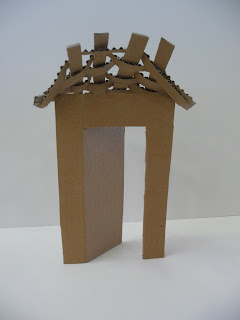
Most of the items included in my portfolio were drafting projects. When I first started drafting I started to view spaces differently. I started to think about exterior and interior, and like we discussed in class, what separates the two. When an object or space is hollow there is a boundary we see that separates the space from the outside world. This boundary is the periphery. With our portal project we experimented with how to make that transition from exterior to interior, or vise versa, easier, or more appealing.

perspective
"The state of existing in space before the eye”
"A mental view or outlook"


The above image is a rendering of one of my projects from a tilted or axonometric perspective.
When putting a portfolio together, especially when the portfolio includes buildings or spaces that you’ve drafted, it is important to keep in mind how the person looking at your work will view it. Because we have knowledge that not all people have, we will understand things more easily, but when you think of the average person you realize you have to include more information so that they can understand what they are looking at. They have a different perspective of your work than you do.
Perspective can also be a physical placement. For example, when viewing a room there are many different angles from which it can be viewed, which will result in many different drawings, or renderings.

"The practice of drawing, as described by Vitruvius, also sounds remarkably modern, for he writes of ground plans (ichnographical) being laid out with compass and ruler, of elevation drawings (orthographic) being 'a vertical image of the front', and of perspective (scaenographia) with shaded and retreating lines converging at a vanishing point." [Roth]

process
"A series of actions or steps taken in order to achieve a particular end."
All of the work we kept was to, in the end, review our own work to see how we have developed over time. Looking at my sketchbook from first semester I’ve already seen an improvement in the way that I take notes. This process and development of my thinking and artistic capabilities will in the end make me a better designer.
In our portal project we had to go through a long process of designing a portal that fulfills commodity, firmness, and delight. The commodity part of this project was that this portal had to tie the work of each group member’s previous projects, and the temple of Queen Hatshepsut all together to make a visually pleasing and structurally sound portal. This was a very difficult thought process, along with physical process too. Coming up with the design was equally as difficult as creating the physical structure and installing it properly. It was a learning process.


professional
"Having or showing great skill"

(Image taken from: http://www.iparenting.com/graphics/dad0103.jpg)
 
With all of these new skills that we're learning and developing our main goal for the end of this process is to become a professional. In this case this means mastering the art of drafting, drawing, developing art skills in general.
We are not only learning the skills that it takes to become professionals, but we study the people who have been professionals for years and how they did so. For example, when we took the field trip to Highpoint University a couple weeks ago we heard Alexander Julian speak. I really enjoyed this. It was so interesting to hear him talk about his own work; what he liked; what he disliked. What interested me most were the designs that were most successful. It was also interesting to hear how some of his previous designs that were considered radical, are very plain compared to today’s fashion. This just solidified in my mind how what we consider to be “good design” will be forever changing.

Friday 6 March 2009

Portal Panel Door Installation


The picture below is our final product for our portal/panel project. I think it was successful in conveying the nature of the temple of queen Hatshepsut. I enjoyed this project immensely, it was a good way to learn how to use several precedents and tie them all together to make one structure. 

Thursday 5 March 2009

Walt Disney Concert Hall

For my building project i have chosen the Walt Disney Concert hall, located in downtown Los Angeles, California. This structure, built by Frank Gehry, opened on October 23, 2003. Because this hall had to meet sonic expectations it took a lot of time to complete. Construction on this building began in 1996 and the groundbreaking ceremony was held in 1999. Even after these three years Frank Gehry took more time to perfect the sound quality of the concert hall and the entire building was complete in 2003. 
Initially when researching twenty first century architecture i chose this building because of its connection to Walt Disney. But after researching further I chose this building because of its extremely unique structure. The exterior of this building looks more like a sculpture than a building. It is visually interesting and appealing, it serves several different functions and, it is structurally sound. 
I am very enthusiastic about this project and to learn more about this building and how it was designed and built. 


(Image taken from http://upload.wikimedia.org/wikipedia/en/d/d6/WaltDisneyConcertHall.jpeg)

Tuesday 3 March 2009

Macro:Micro


Having learned so much about architecture in this past semester and a half one of the most important things that I’ve learned is how people interact with a space. Early architects created a very successful way of leading people through a space by dividing it into a porch, court, and a hearth. Porch, the entrance to a space, is meant to purify a person for entrance. The porch leads to the court, which is a place for all people to gather. The court then leads to the hearth, which is only meant for specific people.
The division of space is not only meant to lead people through, but also acts as a division of wealth or power. People of the lowest class cannot enter into more than the porch. The general public may enter to the court, and only specific people may enter to the hearth. Some good examples of the porch, court, and hearth design are the Salisbury Cathedral in Italy and the Duomo. At both Cathedrals you are purified for entrance through the large archways. Then you are lead through the space to see the court, or main gathering space of the cathedral. Most anyone is allowed to enter the court, but when you progress through the space to the chapel, this section is only allowed for specific people.
In an analysis between these two buildings some things that i noticed was that they both used arches in their design. In both cathedrals you are forced to enter through an archway into a building filled with many arch formed windows. The Duomo had more circular aspects than the Salisbury cathedral. For example some windows in the Duomo are circular and it has a dome with an oculus. Both cathedrals use color in interesting and affective, but different ways. The salisbury cathedral has very intricate stained glass windows, it has painted statues and most importantly it has gorgeous tiled ceilings. The Duomo also incorporates tiles into its ocular domes and ceilings. But it also uses colored tile in on the walls too. The use of these colored tiles is extremely welcoming. It changes the visual and emotional experience of being in the cathedral very drastically.  
The image below is of one of the ocular domes in the Duomo of Florence, Italy. 
(Image taken from  http://www.geneburch.com/gallery/d/1368-3/Florence_Duomo.jpg)


This porch, court, and hearth design is a form of architectural composition. Composition can be defined as “the way in which a whole is made up.” These architects have composed these spaces very carefully to move people in the correct direction through the space. But what is it that actually makes us move through a space? Another aspect of design that we’ve experimented with the past few weeks has been the fact that there are many parts, or details that make up a single space. These details stand out from the overall design and work together to unify the space. These details attract people walking through a space and lead them in the correct pattern. We move from detail to detail.
The details leave impressions. Good details leave big impressions. Some first impressions have to do with the exterior of the building. One way to leave a lasting impression is to make the outside columns extravagant. The order of columns plays a very large role, in roman and greek cultures. 
In our drawing class this week we were assigned another area to focus on for our Curry building project. We were asked to go back to the building and notice the details that are unique to that building. I did multiple drawings of multiple details, and for one of my details I did the bridge connecting the Curry building to the building next to it. This is a detail completely unique to the curry building.
 
In order to convey architectural designs such as these an architect must create diagrams. Throughout the semester I’ve learned that it not only helps the clients understand the designer’s ideas, but it helps the designers themselves to develop their ideas. It helps them to see what may or may not work, what they like and what they don’t like. For example this semester we worked on a project called “Pat’s Chair” and for this project I had a very specific design in mind, but when I tried to construct a smaller scale version of it I had to change certain things to make it more functional or more visually appealing. A lot of the time a designer will have to create multiple models to realize how he wants the design to look, while still making it functional and good looking.
This image below is a photograph of a model of a wall i made. By making this model, or diagram, i was able to understand the way that a wall functions. I learned what needs to happen for a wall to serve it's purpose. Meaning, i learned exactly how precise the measurement and angles at which the wood is cut has to be; I learned the way the wood needs to be put together for it to function well, and i learned what it looks like. 

Winding up the third quarter of my freshman year of college i can honestly say that i have never been so motivated and mentally stimulated. I go home three nights out of the week feeling like my brain is completely fried but i love it. I'm pushing myself hard and learning so much. This week focused on the details that we notice in a building. We were asked to think about how and why they stand out, and what purpose they serve. This too has helped me to look at a space with a more critical and knowing eye. 

Portal Project Ideas


Black and White Project


wall project