Monday, 28 September 2009
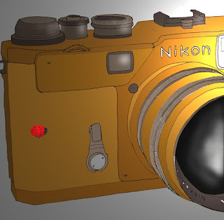
SYTYCD Nikon Camera
 For this weeks "So you think you can ('t) draw" we were asked to draw a camera on white paper with black ink and then render it in photoshop to practice using photoshop more. We were asked to include something to show scale. For this i included a lady bug. I used the lighting tool to make it look as though the camera flash is in action and to show the reflective quality of the camera lens. I also used this technique to show light on the lady bugs wings.
Thursday, 24 September 2009
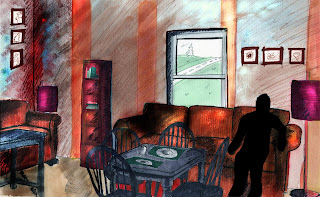
Three different perspectives
 In the perspective shown above i selected different parts of the walls and manipulated their colors and levels of saturation to give the room a very different feeling. I also exaggerated the shading more in certain areas of the perspective.
Tuesday, 22 September 2009
New Perspective
Thursday, 17 September 2009
Color Study
Tuesday, 15 September 2009
Design visualization
Thursday, 3 September 2009
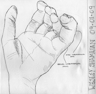
Joint: So You Think You Can't Draw: 1
 I chose to draw the hand. When i was first assigned this project i had no idea what i was going to draw. I looked up "joint" in the dictionary and from the multiple definitions that i found i was able to narrow some things down in my mind but there was still very few limitations to what i could draw.
 Looking through my sketchbook from last year i noticed how much i had improved in the past year and how my sketches of hands in particular were more successful. I decided to show this and draw a hand for this first assignment.
Subscribe to:
Comments (Atom)


